Telling TASB’s Story Through Revamped Logo
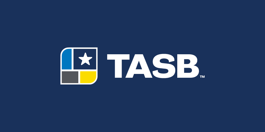
In early 2021, as discussions were underway on revamping TASB’s family of websites, the conversation kept returning to the red, white, and blue logo that’s been a symbol of the Association since 2006.
“We knew we wanted a fresh look for our websites and that our longtime brand didn’t translate well to digital,” said TASB Deputy Executive Director Tiffany Dunne-Oldfield. “We also knew that some people misunderstood our logo and confused TASB for a government entity.”
Yet changing up a longtime brand that has defined TASB for more than 15 years wasn’t a job to take on lightly. The challenge was even more complicated because the brand would not only be reflected on the new website, but it would launch in 2024, which coincides with TASB’s 75th anniversary.
“Whatever we came up with had to tell the story of TASB while also paying tribute to our decades of service in support of our members and public education,” Dunne-Oldfield said. “Just as important, our new brand needed a modern refresh that would translate seamlessly on digital while also positioning TASB strategically for the future.”
Not surprisingly, many nonprofit organizations outsource their rebranding campaigns to ad agencies with experience in planning, designing, and launching a new look. In TASB’s case, the decision was made to leverage the same expertise that has expertly guided and governed the Association since its inception — the TASB Board of Directors.
Not only are TASB directors elected volunteer school board members with deep connections to their school districts and communities, but in many cases, they are also working professionals with extensive backgrounds in business, nonprofit management, law, technology, and consulting, to name just a few.
“As an Association, we are blessed to have such extensive knowledge on our board because our directors are always bringing that trusted experience to the table,” said TASB Executive Director Dan Troxell. “Our success over the past 75 years is really a reflection of our member-led governance structure that ensures TASB is aligning our work with member values, needs, and priorities.”
A Tradition of Innovation
In nearly everything it does, TASB has a tradition of innovation. That’s one of the driving factors behind the large portfolio of services and solutions developed by TASB over the decades. When school districts identified a need that wasn’t being addressed in the private sector, TASB would step in with a program to help — from board training and superintendent searches to policy and legal services.
As for the TASB logo, however, not much had changed since the Association’s inception. In fact, prior to 2006, when TASB launched its red, white, and blue logo, there had only been variations of one other graphic element — an outline of Texas with TASB aligned vertically on the left.
“We used it all the time on everything,” recalled Kathy Dundee, TASB’s director of Conference and Event Planning. “I remember it was on programs for Summer Leadership Institute as well as Leadership TASB. It was around for a very long time.”
That previous brand didn’t change until 2006, when TASB underwent another major change — moving from its longtime address of North Lamar, Guadalupe Street, and U.S. Highway 183 to its current headquarters on Research Boulevard to accommodate the need for more space.
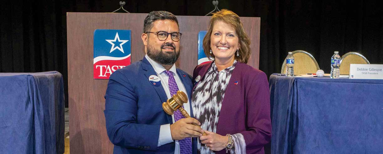
That’s when the Association launched the red, white, and blue logo with a distinctive star against a blue background and the TASB letters aligned in white against a backdrop of red. The look evokes the Texas flag and related feelings of loyalty and affection for the Lone Star state.
Aligning the launch of that brand with the 2006 move made sense: TASB leadership wanted a fresh look for its brand-new headquarters.
The same was true as recent work on the tasb.org website required a brand modernization for TASB’s new digital home, complete with refreshed colors and design. At the forefront of this work was a key group of five TASB directors working as the Planning and Development Subcommittee on Brand Modernization. Their charge was to come up with a recommendation to the TASB Board of Directors for a new TASB brand and logo with the goal of:
- Modernizing the TASB brand while respecting the history and legacy of past members and leaders
- Cultivating a look and feel that positions TASB as a member-focused, data-driven, and digitally intelligent nonprofit organization
- Differentiating ourselves from governmental agencies and clarifying who we are, what we do, and why we do it
“We appreciated having the opportunity to guide this project,” said TASB Immediate Past President and subcommittee member Debbie Gillespie, who formerly served on the Frisco ISD board. “TASB staff were all so incredibly responsive to the committee’s concerns and questions as we worked through many possible designs and color combinations. We talked about the history of TASB along with our mission, the meaning of the design, colors, and how to incorporate them all into the logo.”
Gillespie acknowledged that she was personally partial to the red, white, and blue logo, but she kept an open mind as she and the other subcommittee members considered the possibilities. Joining her in this work were TASB First Vice President Tony Hopkins, who serves on the Friendswood ISD board; TASB Director Sylvia Sánchez Garza of South Texas ISD; TASB Director Linda Gooch of Sunnyvale ISD; and former TASB Director Robert Westbrook, who until recently served on the Schertz-Cibolo-Universal City ISD board.
Keeping Students at the Center
Over the course of three months, the subcommittee met a total of three times to look at different designs, iterations, and color combinations. In spring 2023, they directed TASB staff to be more intentional about spotlighting the “why” behind everything TASB does — namely the more than 5.4 million public school children across the state.
“We had some great choices and ideas, but we all agreed that we wanted to remain student centered while also recognizing that each district within the 20 regions is very different,” Gillespie said. “The committee also wanted to acknowledge and incorporate how crucial the partnerships among students, staff, parents, and community members are to the success of all of our students.”
Hopkins also noted the importance of paying tribute to TASB’s 75-year legacy while positioning the association for the future. “The committee also wanted to make sure the new brand would allow TASB to highlight that they offer a broad variety of services that enhance the day-to-day activities of school district operations and give voice to the needs of school boards across the state,” he said.
At its March 2023 meeting, the committee got the opportunity to share the result of all the work with the entire TASB Board of Directors, which approved the new logo and brand, even as some tweaks were still being made to the brand story, which describes the elements of the new logo and what they symbolize for TASB and our members. (See brand story details in box on following page.)
At the same time, TASB staff members were working on the rollout plan for the new logo, keeping in mind that the formal launch would coordinate with the unveiling of the new tasb.org website in January 2024. To minimize budget impact, the decision was made to take a thoughtful approach to updating materials with the new brand, a process that is expected to take the entire year.
“From business cards to PowerPoint templates and hundreds of other items, the TASB logo is everywhere, and we knew we would not be able to change out everything overnight because of the time and costs involved,” said TASB Brand and Marketing Director Stephany Wagner-Thornhill, who is overseeing the implementation of the new brand. “We’re prioritizing those materials that have the highest visibility among our members, from training materials and event programs to TASB branded presentations and publications.”
Hopkins said the new brand, and everything it represents, “highlights the groups vital to the success of schools in Texas, which is a collective effort of school board members, employees, parents, and the communities we serve — all focused on helping each student succeed in Texas.”
Gillespie is optimistic that the new brand will be well received, even as some members may feel a bit of nostalgia for the red, white, and blue logo that served TASB so well for so long. For her part, Gillespie said she’s going to cherish her old TASB lapel pin while wearing the one with the new brand at upcoming TASB events and meetings.
“Change can be difficult, but it’s also exciting,” she said. “Our subcommittee had a lot of meaningful discussions about our TASB history and our TASB future, and I think the new logo is a true reflection of our mission to promote educational excellence for all of our Texas public school students.”

Our TASB Brand Story
We are TASB, and our brand reflects our members and their unified voice in support of public education.
Sylvia Wood
Sylvia Wood is the division director of communications for TASB.


